
Aeero
Aeero is a study assistant that lives in a student's text messages. I helped design its website and built it, from the call to action that opens a text to the blog.
- Website for a startup
- 2026
- Design and front-end engineering
- apps to install. The call to action is a text
- 0apps to install. The call to action is a text
- blog posts at launch
- 10blog posts at launch
- bubble colours: blue on Apple, green on Android
- 2bubble colours: blue on Apple, green on Android
The brief
Aeero is an AI assistant that college students text. It tracks their deadlines, knows their classes and does the maths on what they need in the final. A friend built the product and asked me to replace its one-page site with something that could explain the idea in a few seconds and carry a blog.
I helped design the website and built it. The assistant itself is my friend's work.
Design
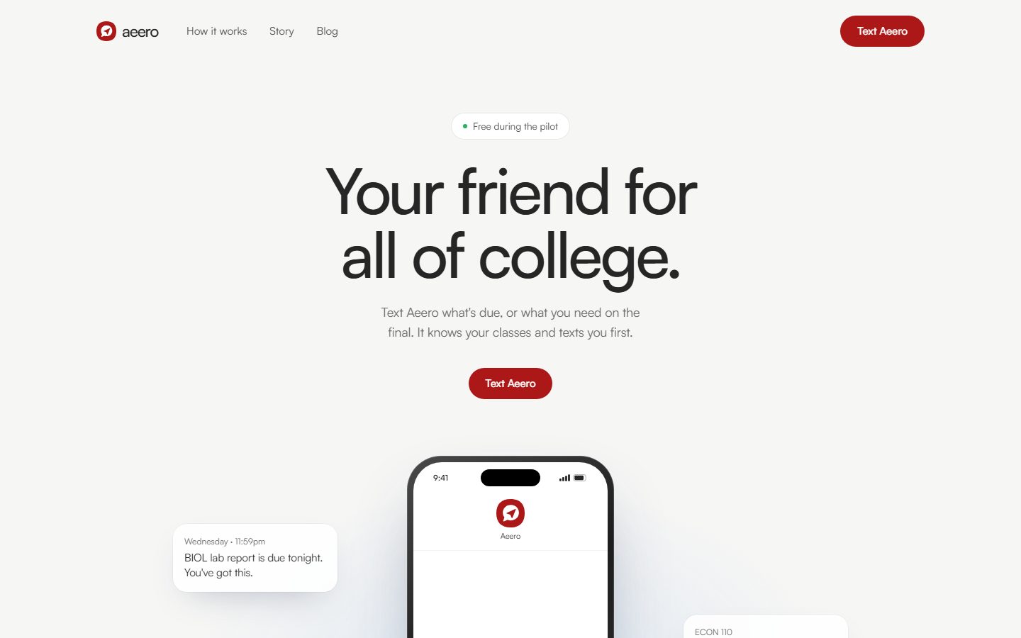
There is no app to download and no account to make, so the site could not lean on screenshots of a dashboard. The product is a conversation, and the page had to show one. We settled on three rules:
- Show the texts. A phone sits in the hero with a real exchange in it, and message cards float beside it with the kind of nudge Aeero sends on a Wednesday night
- One idea per screen. Each section answers one question a student would ask: does it work with my school, what does it remember, what does it do before I ask
- One colour. A warm off-white page, near-black type and a single red for the only action that matters, Text Aeero
What I built
- A fast, prerendered Next.js site with a blog written in MDX
- A call to action that fits the device: on a phone it opens Messages with the number filled in, and on a desktop it shows a QR code to scan
- Chat bubbles that match your phone. A tiny inline script detects the operating system before the first paint, so the demo conversation is iMessage blue on Apple devices and SMS green on Android, with no flash
- A final-grade calculator: the score you need on the final for each letter grade
- Generated share images, FAQ and how-to structured data, and
llms.txtroutes so AI answer engines can read the site
Accessibility and UX
The whole pitch is that there is nothing new to learn, so the site had to feel the same. One idea per screen, short sentences, and motion that switches off when the visitor asks for less.
Outcome
The version I designed and built is kept at aeero.oseiagm.com. The product has kept moving since, and its current site is at aeero.io.